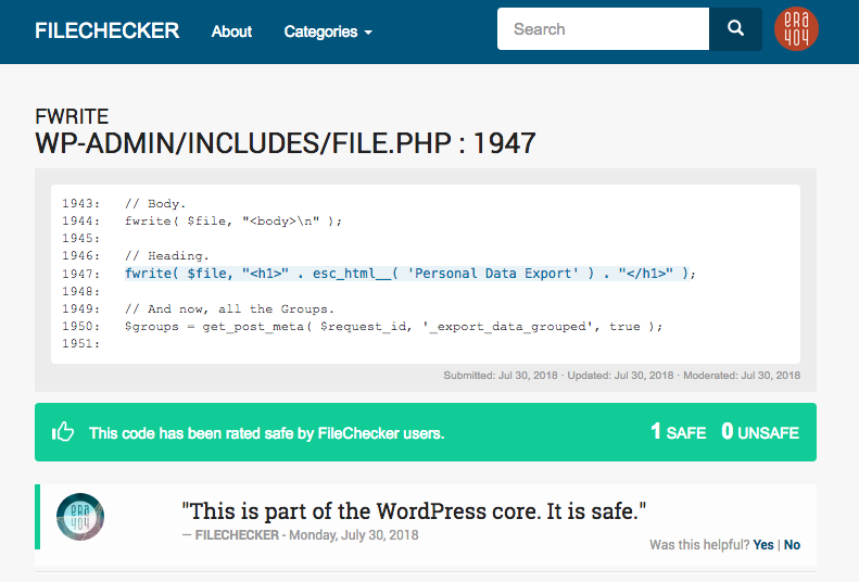
FileChecker WordPress Plugin and FileChecker.net

FileChecker Wordpress Plugin

I’m pretty proud of this one.

If you’ve used WordPress before, you know that it’s a blogging platform built predominately by contributors. Though Automattic created the core, developers around the world contribute to themes and plugins that make WordPress far more robust than its competition (Wix, Joomla, Drupal, for example). [d]online is built on WordPress, as is my company site, era404.com. Read more

Category: Web

Mobile Websites vs. Applications

Mobile Websites vs Applications

There’s no denying that mobile phones have grown to become an increasing part of our lives. In fact, there’s a 42% likelihood that you’re reading this newsletter on your phone or tablet device, up 10% from last March. And in most cases, mobile applications would probably be overkill for your business or brand, where a beautifully designed, responsive newsletter (such as this one) will more than suffice. However, if you’re looking for something more than emails, here are some things for you to consider.

There’s a big difference between a mobile website and a mobile application. Before you can evaluate the benefits of either, it’s important to understand the key differences between the two. Both apps and mobile websites are accessed on a handheld devices such as smartphones (e.g. iPhone, Android and Blackberry) and tablets.

Read the rest of the newsletter here

Google Author Tag

Google Author Tag

Todd recently pointed me to the attention of Google’s new “author” tag, to help users read more articles by journalists and bloggers, and their new “publisher” tag, to help users find more articles by companies and organizations. Hopefully, within the next few months, you’ll be able to see my mug appearing by articles in Google search results pages, directing your attention to other articles I’ve written.

If you’re interested in learning more about author and publisher tags, read this article (and other information resources) on my design studio’s site: era404.com.

Twitter Cards

[d]online - Twitter Card Example

[d]online - Twitter Card Example

If you’re an avid user of Twitter, you’ve probably noticed the new links that show up on the bottom of certain tweets in your feed. The links say “View Summary” and allow you to read the title and excerpt of an article, along with a thumbnail of the article’s featured image. Those links are called Twitter Cards, come in three different varieties: summaries, photos, and play, and have two different layouts:  web and mobile.

Twitter Cards help increase your visibility and ensourage users to click to your site by providing more information beyond Twitter’s 140 character limit. Furthermore, design and development studios with Twitter Card functionality built into their site can provide a working example for clients to see how the same functionality can be implemented into their sites.

As with most of Twitter’s APIs, Twitter cards are fairly quick to implement. All you need to do is insert some metadata, test, and apply to participate. To make things even easier, Niall Kennedy has created a WordPress plug-in to automatically scrape your post’s title, permalink, description and image URL for summary Twitter cards. After installing and activating the plug-in, preview your Twitter card by pasting the post’s URL into their preview page.Lastly, you’ll need to apply to participate. Simply enter your site and contact information here and Twitter will reply within 5-10 business days.
PANTONE® Moods Widget

Maybe you’ve noticed that colorful rotating widget to the left of this post (when this post was on the home page). That cool little plug-in was created for PANTONE® as part of our Facebook Moods project. The two panels show realtime Moods posted to Facebook, and a digest of the previous day’s most popular color, keyword and city. In terms of cities and their magnitude of Moods posted, by the way, São Paulo has got us beat by almost 400%:

Popular Locations/Colors

You can see all Pantone Moods trends by clicking here, after you’ve logged in to Facebook and approved the application. And, naturally, you can see your mood show up on the widget simply by posting a new one and waiting for the widget to cycle through the most recent 15 moods posted.

Anyway, I’m curious to hear what you think about the widget. Drop me a line or post a comment below.

Category: Web

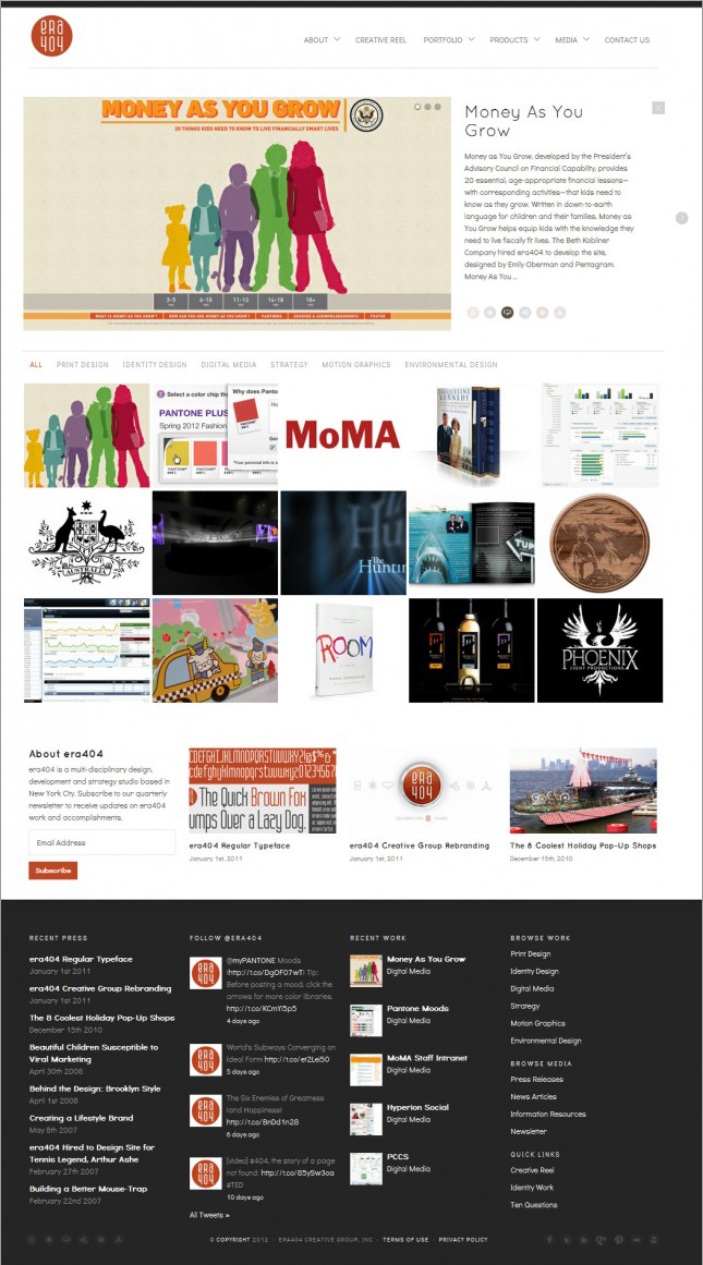
era404.com Reboot

era404 screenshot

I always say that the cobbler’s kids have the oldest shoes. The last relaunch of era404.com had been in 2005, before the widespread use of iOS devices (which don’t support Adobe Flash) and the release of browsers capable of supporting HTML5, CSS3 and JQuery.

For the last few years, as all designers seem to do, I kept saying “God, I really need to update our site.” As my brother Chris always says, “the second worst problem in the world is having too much work, but it’s far better than the alternative.” era404 has been fortunate in that we’ve never found ourselves with too much idle time on our hands. That said, we’ve been seriously lacking in the capacity to explore new business development and professional upkeep and maintenance on our public image. Until now. Read more