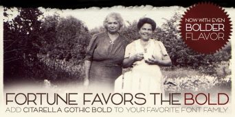
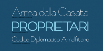
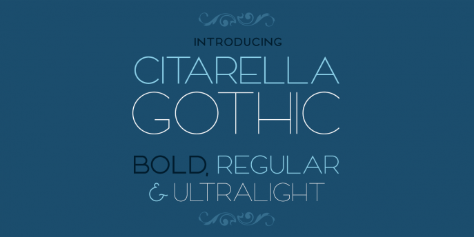
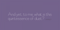
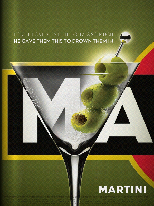
The third weight of the Citarella Gothic family is now available on MyFonts.
magazine
Citarella Gothic Ultralight
I’m happy to announce that Citarella Gothic Ultralight is officially on-sale at MyFonts. Here’s the description:
About Citarella Gothic:
In seeking a strong, utilitarian gothic alternative for Helvetica, we’re left with few options for unobtrusive functionalism. As such, I decided to create the Citarella Gothic family. The ligatures are characteristic of the signage and architecture around Sarno, Italy, where the Citarella family originates. The sweeping arcs, broad counters, and clean swashes allow for the architectural design to be imbued with the warmth and humanity of its namesake.
Over time, I hope to extend the family to other weights and styles, but decided to start with the ultralight version and work my way through black. In the meantime, visit MyFonts.com to play around with the font. Your feedback is appreciated, as is, of course, your patronage.
&
Seeing Herb Lubalin’s lovely Mother & Child logo in U & lc magazine began my obsession with ampersands. There has always been something elegant and foreign and vaguely mystical about the character. In band class, I imagined it the reverse treble clef. And in each hand-written letter from friends and relatives, I scoured their penmanship to see the nuance and personality they instilled in their own use of the ampersand. Was it the backwards 3? The pretzel? Was it rounded or squared off? Where was the baseline, the flair, the counters and eyes, the panache and bravado? What was the character of their character? Read more
Overdue Casualties of the Recession
Over the last year, a lot of the way we promote ourselves has changed. The latest casualty in this transition is Creative Hotlist, a paid service provided by Communication Arts.
As you probably remember from previous posts, I’ve whittled my periodical subscriptions from six down to two: HOW and Step Inside Design. Other than the recession itself, there are numerous reasons for this decision. Ultimately the choice was made based on one simple word: value. Read more
