2011 – The Year Everything Changed at FWA

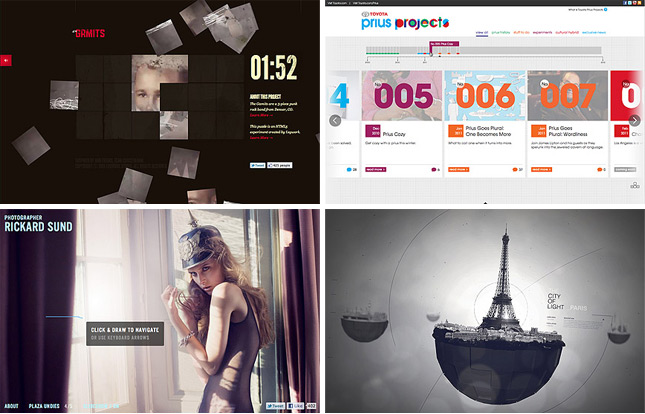
Up until February 2007, FWA had almost entirely been awarding Flash websites. For 7 years, every day, a new Site Of The Day (SOTD) was being announced and it was always, almost completely, Flash deployed. The team at Ogilvy Singapore changed everything when they submitted Levi’s Copper Jeans and it went on to win SOTD on 21st February 2007. This site still stands shoulder to shoulder with the best non-Flash sites of 2011 and will always stand out as the seed of change at FWA.

For the next three years we saw the occassional plugin free site win an FWA but in 2010, the playing field was destroyed when The Wilderness Downtown landed on the FWA judges. The interactive short film immediately earned its place in FWA history as it went on to win Site Of The Year (SOTY) for 2010. Whilst raising a lot of eyebrows amongst some of FWA’s hardcore fans, I know personally and amongst the judges for SOTY that there was no doubt that Arcade Fire’s “We Used to Wait” promo site had raised the bar to a level we were not quite expecting.

2011… when everything REALLY DID change at FWA

Read more…

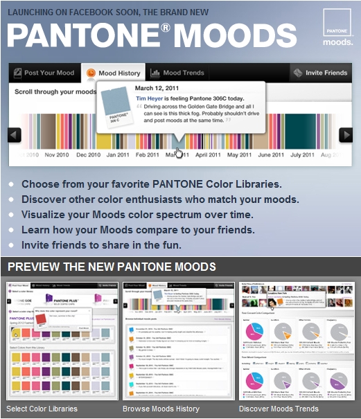
Pantone Moods v2.0

We’re excited to be working with Pantone again to develop a more robust version of our Moods Facebook Application. The announcement went live on Facebook on Friday and I’d love any feedback you can provide while we’re working on developing it. Your ideas can help mold this and future versions of the application.

Vector Browser Components

I’ve updated this template on my original post, here, to include additional form elements (radio buttons, checkboxes, form and combo box fields) as well as the original vector scrollbars to make it easier to mock-up UIs in Adobe Illustrator.

Download the .AI/.EPS/.PDF (Zip)

Seven Questions to Ask When Designing the Feel of Your Mobile App

Feel Can Make or Break a Product
Imagine you are shopping for a new car. You found a model that looks great and has all the features you want. It’s even in your price range. So you go to the dealer and take a test drive. After about five minutes of driving, you find you are mildly dissatisfied with the car. Perhaps it’s the way it takes the bumps. Perhaps it’s difficult to check your blind spot. Perhaps the pedals and buttons are not responsive. Do you buy the car anyway? After all, you like the look, it’s a good buy and it’s got the features you want. Odds are though you are not going to buy it. Why? Because you don’t like the feel of it, and the majority of your experience with a car is tied to the feel.

Feel Plays a Key role in Mobile App Satisfaction
Since mobile devices are held in our hands and operated with touch, the feel of the experience becomes a key determinant of user satisfaction. Also, since the screens are small, more interaction is generally required than on desktop devices. So we experience the nuances of the feel again and again as we use an app. Mild annoyances can add up, let alone major ones. Conversely, a good feel will create an ongoing sense of ease and comfort. This makes it more likely the app will be used repeatedly, bubble up on users’ favorites list, be talked about and recommended to others.

Seven Questions to Ask When Designing the Feel of Your App
So are you ready to optimize the feel of your mobile app? To help, here is a list of questions worth asking when designing a mobile app to make sure you have addressed the feel:

  1.  Have you anticipated how the user will hold the device?
  2. Have you designed for operation using fingers, thumbs or a combination of the two?
  3. Have you eliminated undesirable “eclipsing” effects, that is, uncomfortable blind spots where the finger obscures what is being touched in such a way that the interaction is awkward
  4. On screens with a dense amount of content, have you kept the structure of the layout and interactions simple?
  5. Have you used an intuitive sequence of gestures to perform core tasks?
  6. Have you minimized user effort to see, locate and interact with elements on the screen?
  7. Have you asked someone (or several people) to try a prototype of your app on an actual device?

Check your design against the above items, and you will find the improvements you make to the feel of your app to be well worth the effort.

Original post: Bob Moll, Pathfinder Software

Window Focus and Blur

In working on the new Pantone Moods this week, I needed to add a listener to the widget to halt the realtime updates if a user no longer had the page active (meaning, they switched to another browser tab or application) to prevent unnecessary traffic to the server.

The application cycles through the ten most recent Moods posts and, upon nearing the end of its cache, queried the server for a new supply. However, if someone’s focus wasn’t on the page, it makes no sense to keep collecting and displaying results.

With ActionScript 3, this task is quite easy:

stage.addEventListener(Event.DEACTIVATE, onDeactivate);
stage.addEventListener(Event.ACTIVATE, onActivate);

And it’s just as easy when programming for Mobile Applications:

NativeApplication.nativeApplication.addEventListener(Event.ACTIVATE, onActivate);
NativeApplication.nativeApplication.addEventListener(Event.DEACTIVATE, onDeactivate);

With JQuery, we can now accomplish the same thing for AJAX/PHP browser applications to no longer commit resources to updating a page that isn’t being viewed:

$(function(){
	$(window).bind('blur', function(){
		onDeactivate();
	});
 
	$(window).bind('focus', function(){
		onActivate();
	});
	// IE EVENTS
	$(document).bind('focusout', function(){
		onDeactivate();
	});
	$(document).bind('focusin', function(){
		onActivate();
	});
});

Note that the second two methods must be added because Internet Explorer uses focusin/focusout rather than simply focus/blur.

Remembering 9/11

911.01

I’d debated putting this post up for a long time. In fact, for the last decade, I was convinced that it had no place in a personal blog. Any reference to those terrible events, commingled with announcements of my studio‘s successes and incessant ramblings about the decline of customer service, just seemed to be a flagrant rodomontade more than a eulogy. In light of the barrage of articles commemorating the ten-year anniversary of the tragedy, the shameful exposure of Vincent Forres and the 9/11 profiteers, and the revelation that I now have a 19% increased chance of developing cancer, I’d begun to re-evaluate this position.

This week, I shared my concern of cancer to a dear friend, a friend that I’ve known since 2003, and he was surprised to hear that I even volunteered.  To someone with whom I share almost everything, it seemed equally surprising to me that I hadn’t mentioned it either. Maybe you should write something, he said. His suggestion was probably prompted by the concern for why I’ve remained silent for the last decade. And my understanding of this is ultimately what has lead to this post. Read more