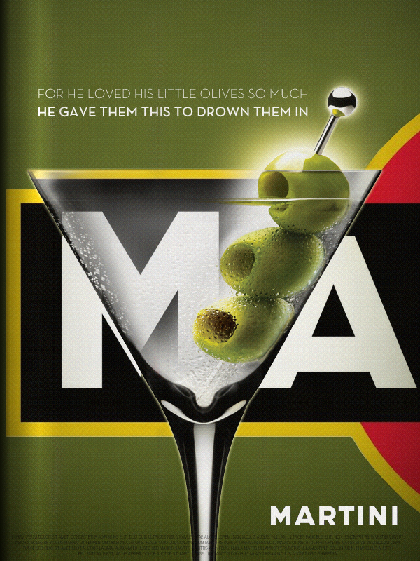
Seeing Herb Lubalin’s lovely Mother & Child logo in U & lc magazine began my obsession with ampersands. There has always been something elegant and foreign and vaguely mystical about the character. In band class, I imagined it the reverse treble clef. And in each hand-written letter from friends and relatives, I scoured their penmanship to see the nuance and personality they instilled in their own use of the ampersand. Was it the backwards 3? The pretzel? Was it rounded or squared off? Where was the baseline, the flair, the counters and eyes, the panache and bravado? What was the character of their character? Read more
design
Sabeena Karnik
Take a look at this beautifully meticulous, hand-crafted paper alphabet by Sabeena Karnik, a caligrapher, fine artist and illustrator/ typographer specializing in paper sculpturing and acrylic murals.

NEST: Smart and Beautiful
Beautiful, utilitarian product design has always thrilled me. Dyson is my idol and half the products I see over at the Swissmiss blog leave me drooling. Take a look at this new device, billed as the world’s first Learning Thermostat.
Nest learns from your temperature adjustments, programs itself to keep you comfortable, and guides you to energy savings. You can control the thermostat from anywhere using a smartphone, tablet or laptop, and Nest never stops learning, even as your life and the seasons change.
httpv://www.youtube.com/watch?v=QCJ1PnVlzIE
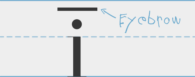
The Eyebrow and The Costumed Fish

When I was a little kid, I learned the difference between long and short vowel. The teachers explained that an ī (long I), found in words like mile and fine, were signified by a macron, or horizontal line, over the letter. And an ĭ (short I), found in words like mill and fin, were signified by a breve, or tiny u, over the letter.
Read more
2011 – The Year Everything Changed at FWA
Up until February 2007, FWA had almost entirely been awarding Flash websites. For 7 years, every day, a new Site Of The Day (SOTD) was being announced and it was always, almost completely, Flash deployed. The team at Ogilvy Singapore changed everything when they submitted Levi’s Copper Jeans and it went on to win SOTD on 21st February 2007. This site still stands shoulder to shoulder with the best non-Flash sites of 2011 and will always stand out as the seed of change at FWA.
For the next three years we saw the occassional plugin free site win an FWA but in 2010, the playing field was destroyed when The Wilderness Downtown landed on the FWA judges. The interactive short film immediately earned its place in FWA history as it went on to win Site Of The Year (SOTY) for 2010. Whilst raising a lot of eyebrows amongst some of FWA’s hardcore fans, I know personally and amongst the judges for SOTY that there was no doubt that Arcade Fire’s “We Used to Wait” promo site had raised the bar to a level we were not quite expecting.
2011… when everything REALLY DID change at FWA
Pantone Moods v2.0
We’re excited to be working with Pantone again to develop a more robust version of our Moods Facebook Application. The announcement went live on Facebook on Friday and I’d love any feedback you can provide while we’re working on developing it. Your ideas can help mold this and future versions of the application.


